Separate tone from grain
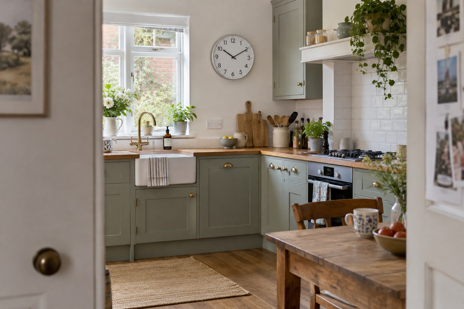
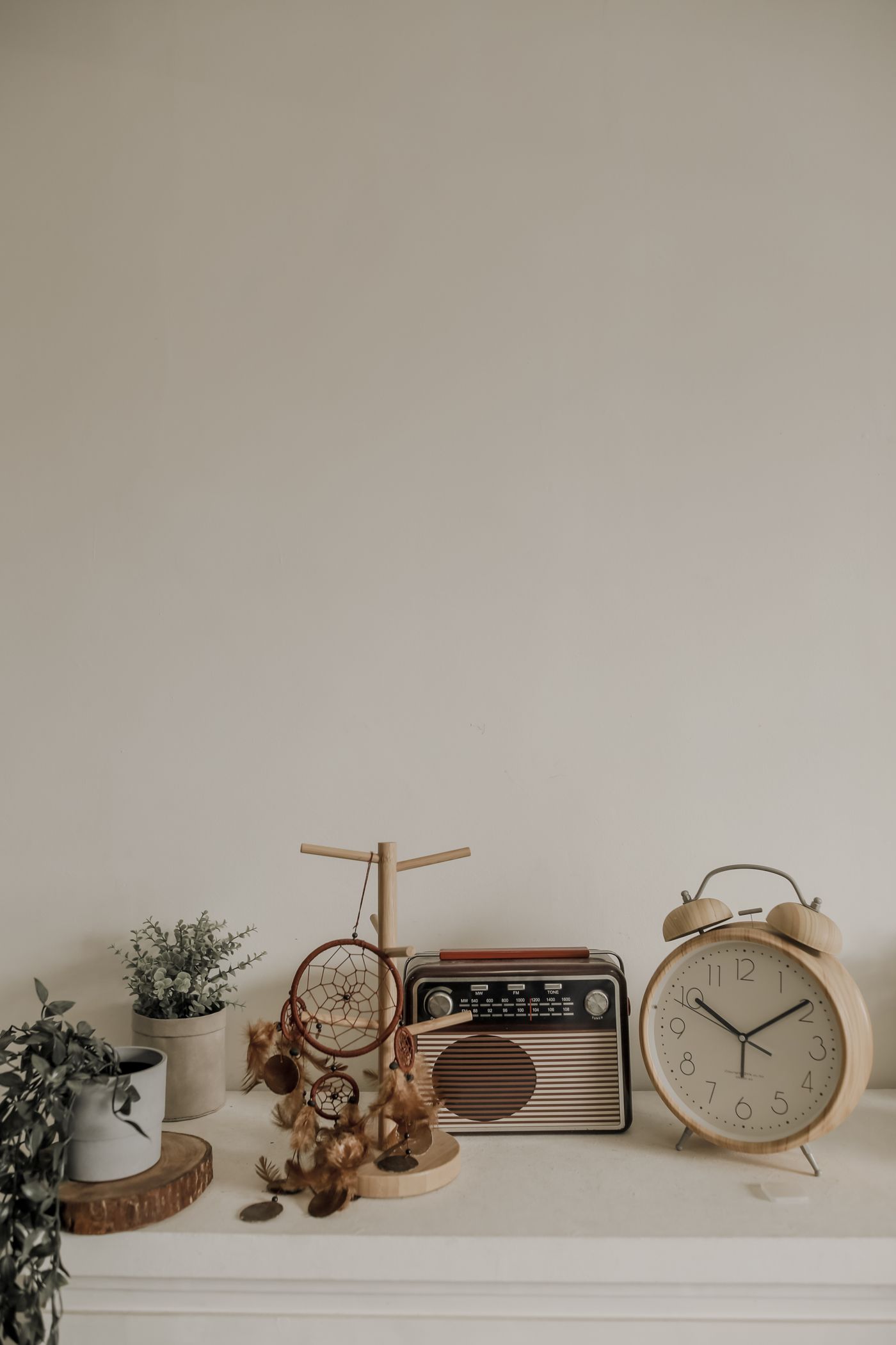
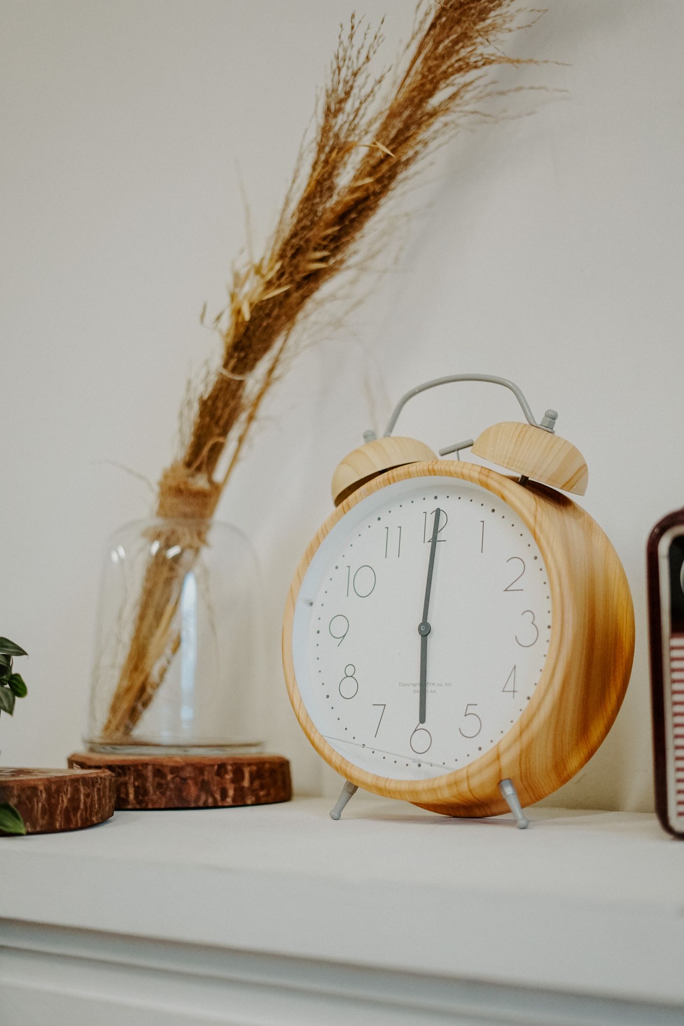
A wooden clock brings two visible qualities: its overall tone and the pattern of its grain. A pale, straight-grained case and a heavily figured pale case can have very different effects. Compare both with the furniture rather than deciding from the word oak, walnut or pine in a listing.
Lighting and surface coatings influence the appearance. View the room in daylight and under its normal evening lamps. A clock that looks neutral in a product photograph may appear warmer beside a cooler floor or a painted wall. Treat online colour as an indication, not a guarantee.
Find one useful link
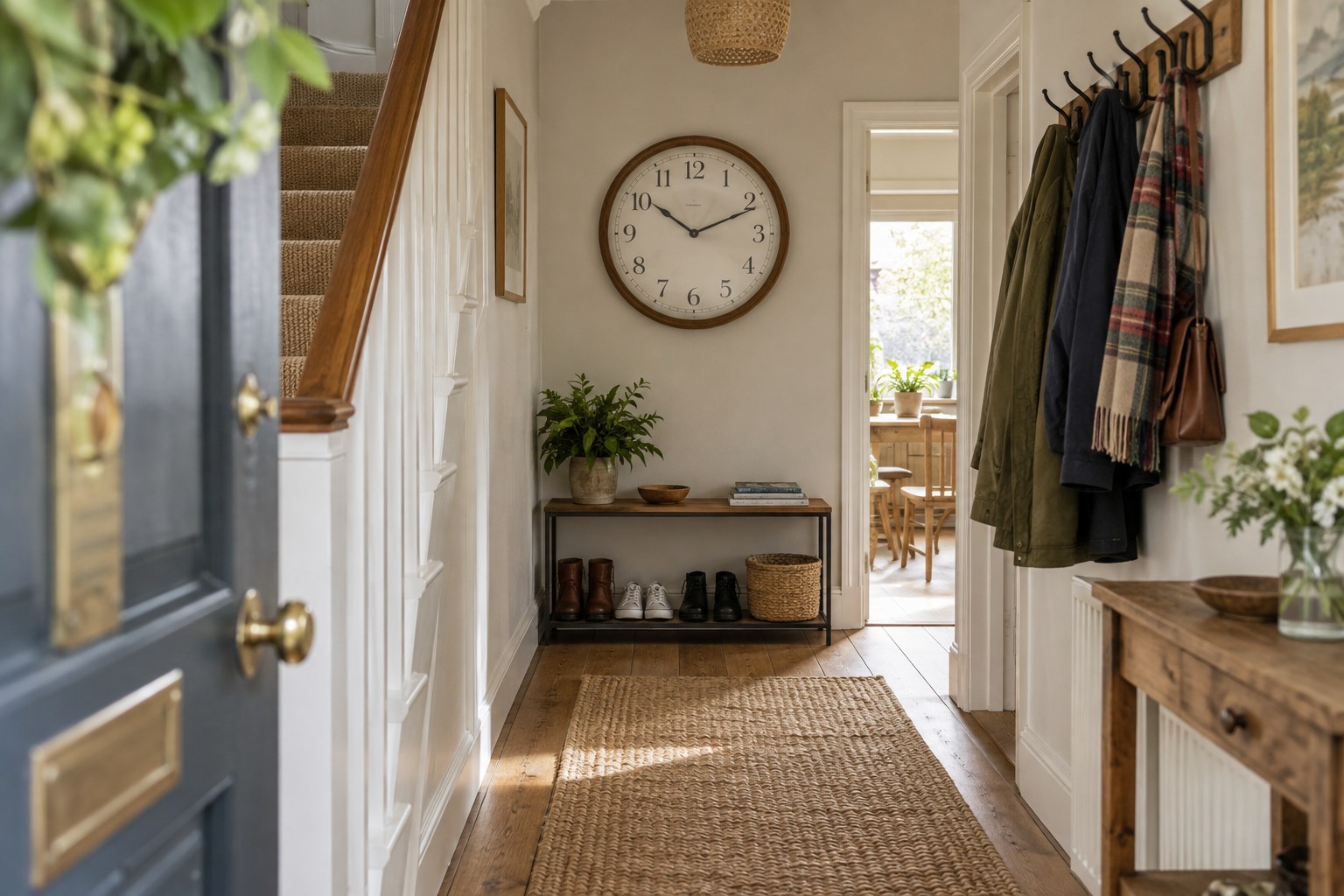
Choose one relationship to repeat: perhaps the clock echoes the warmth of a chair, the dark outline of a cabinet or the simple shape of a shelf. It need not match the largest piece of furniture. A smaller repeated detail can make mixed timbers feel intentional without making the room uniform.
If the room already has strong grain patterns, a plain dial and a restrained case shape can provide a pause. Conversely, a modest wooden clock may introduce texture to a mostly painted room. Judge the whole silhouette before concentrating on the wood species.
Keep placement and finish in mind
A wooden case needs a suitable environment as well as a pleasing background. Avoid places that become hot, damp or strongly sunlit, and follow the maker's care guidance. Do not assume that a finish used on a dining table is appropriate for a clock case.
Put a photograph or paper outline in the proposed position before buying. Check whether the wall provides enough contrast for the edge of the clock to remain visible. If the clock disappears against a timber panel, a different face colour or a clearer surrounding gap may solve the problem better than more ornament.