Describe the finish accurately
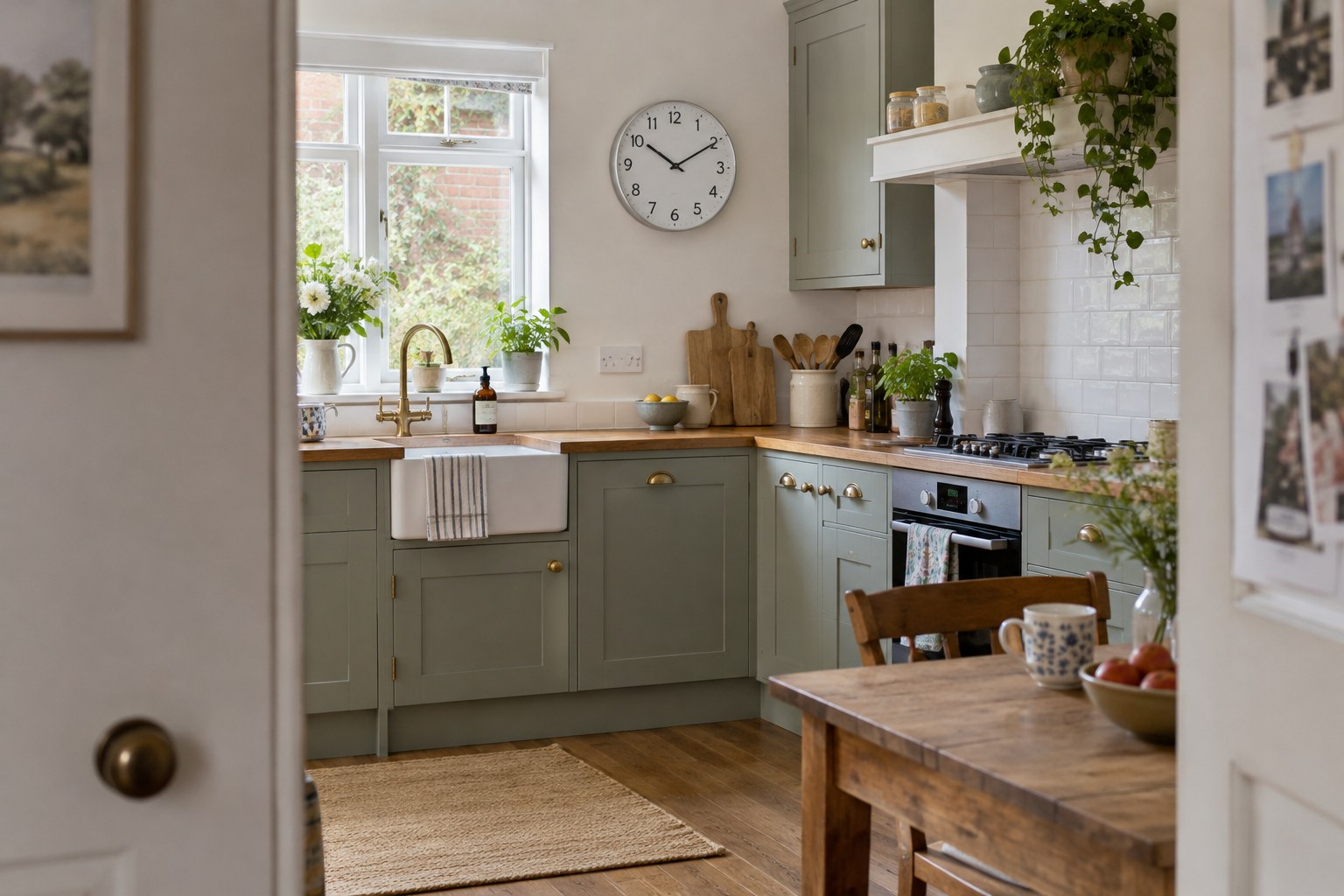
Metal colour alone is not enough. Brushed brass, polished brass and a warm painted finish can look quite different beside the same lamp. Look at whether the clock's surface reflects sharply, diffuses the light or appears almost matt. That quality often affects the room more than a small difference in colour.
Collect photographs of the existing handles, lights and frames in daylight. If possible, compare a physical finish sample or see the clock in person. Online pictures can exaggerate warmth or remove surface texture, so avoid treating a screen colour as an exact specification.
Choose a relationship, not a perfect copy
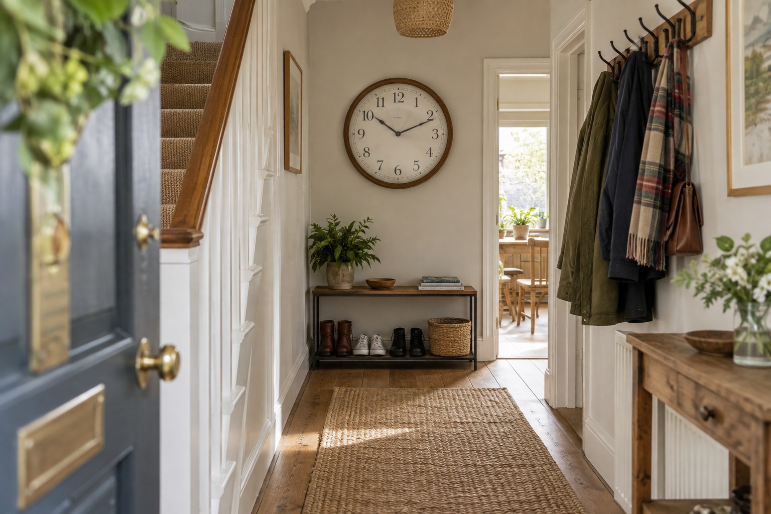
A room can accommodate more than one metal finish. Repeating a similar warmth or level of sheen may be enough to connect the clock with nearby objects. For example, a quiet brushed case can sit alongside shinier small handles without needing to imitate them.
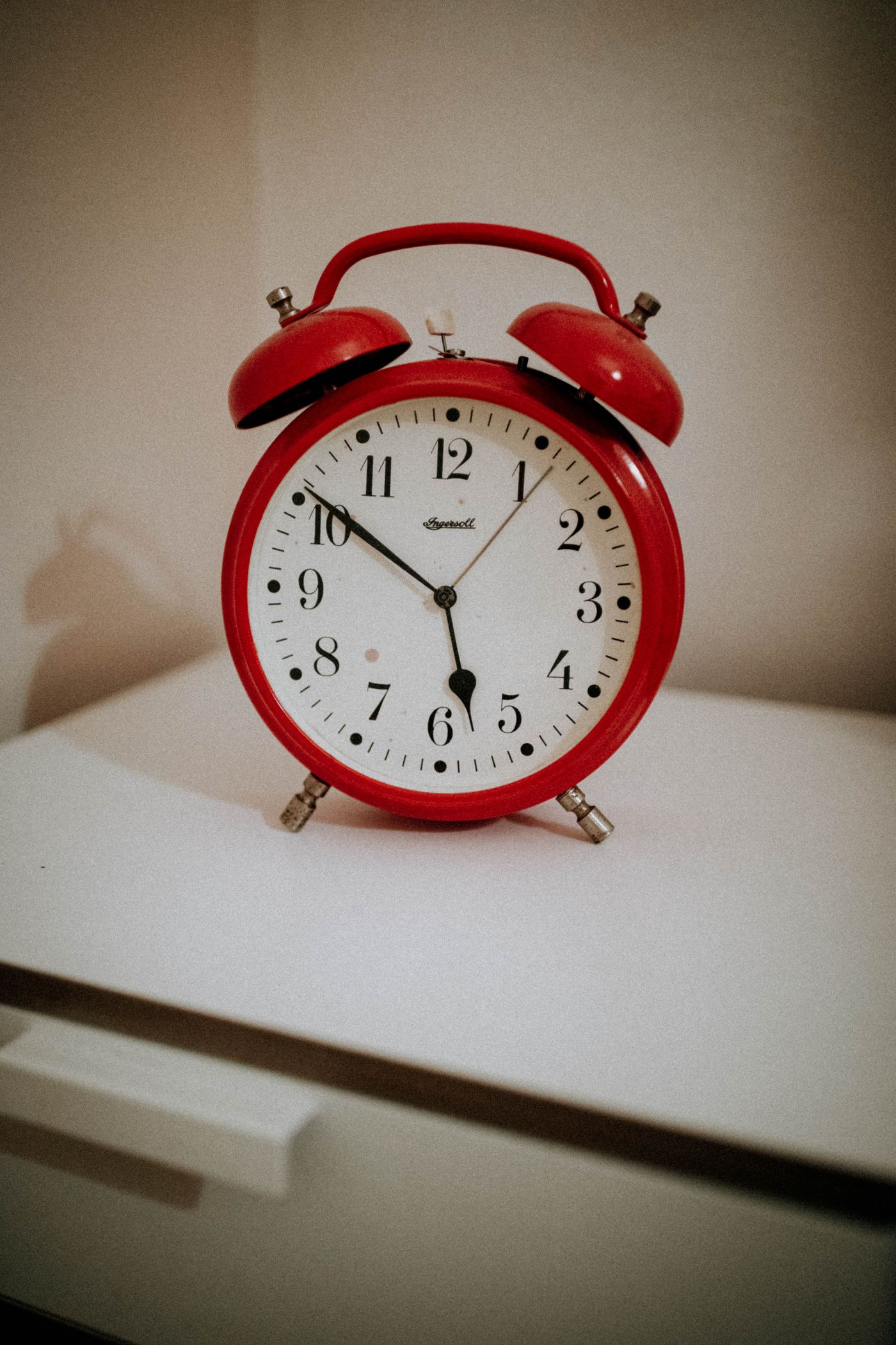
Consider the size of the metal area. A broad polished rim makes a stronger statement than a fine dark outline around the dial. If the room already contains large reflective surfaces, a narrow or matt case may be easier to place. A sample held at arm's length helps reveal this difference in visual weight.
Include the dial and the background
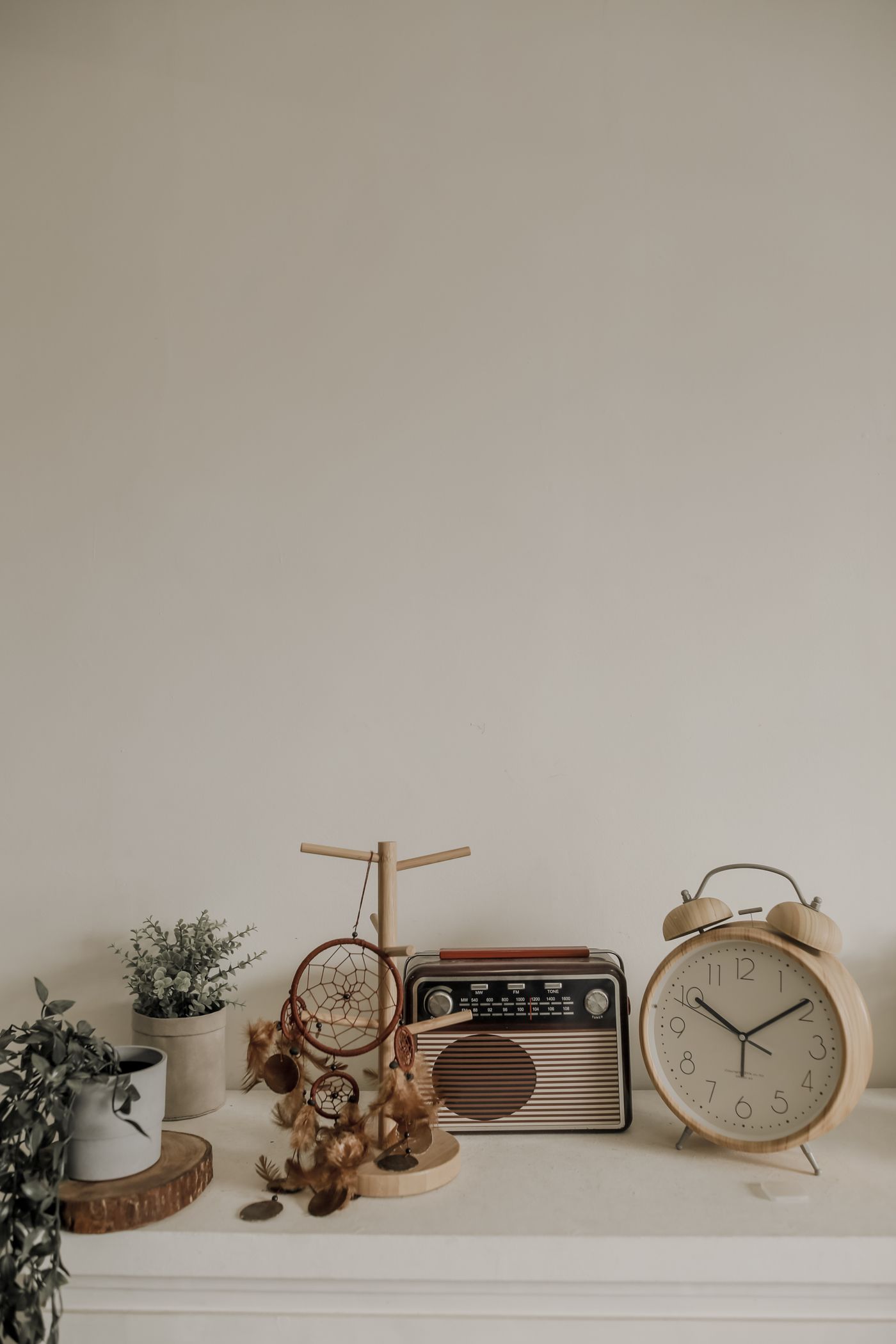
The face is usually a larger area than the metal rim. Compare its colour with the wall, furniture and lampshades as well. A cream dial can soften a cool metal case, while a stark white face may make the same rim feel crisper.
Check reflections in the intended position and leave the original finish intact. Abrading, polishing or coating a new case to force a colour match can change its appearance unevenly and may conflict with the maker's care guidance. If the finish is wrong for the room, choosing another clock is often the simpler decision.