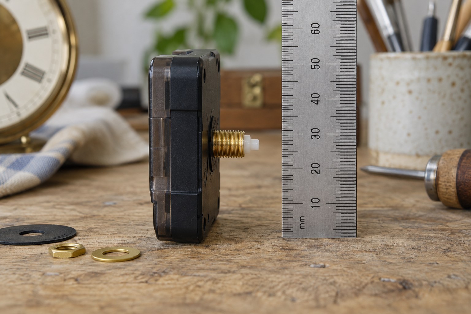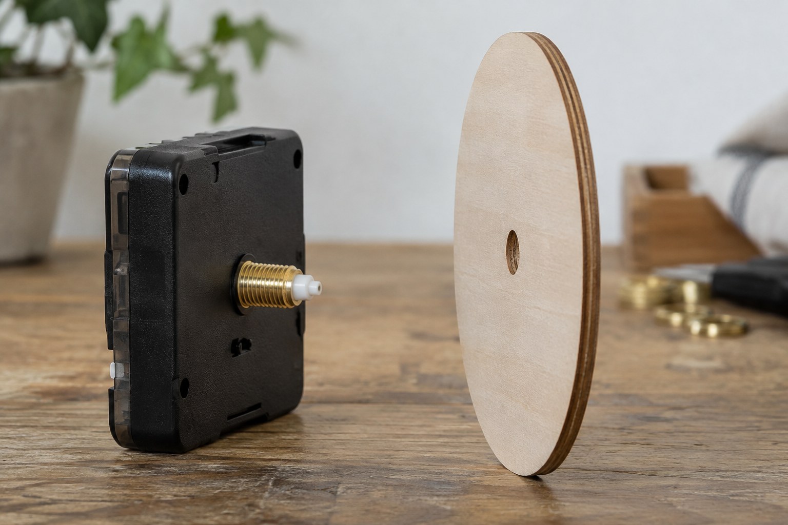
Begin with the reading task
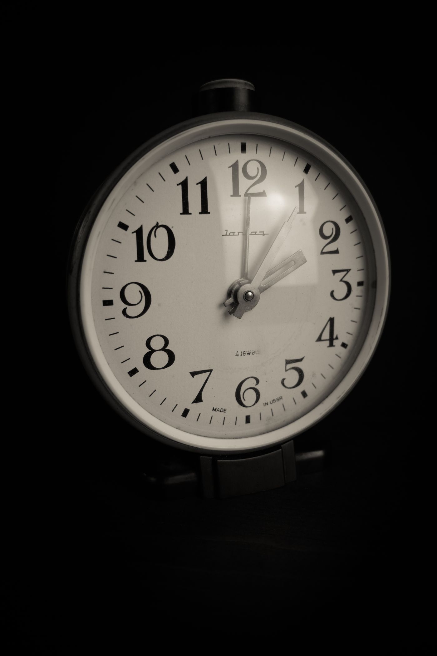
Place samples of your proposed background and hand colours beside one another. Look for an obvious difference in lightness rather than relying only on different hues. Two colours that feel distinct in a paint chart may merge in a dim room. A plain pale face with dark hands is a useful comparison point even if your final design differs. Consider the part of the day when the clock matters most. A kitchen face checked in morning daylight and a bedroom face seen under a small lamp have different surroundings. Test real samples there instead of judging everything on a luminous screen.
Give the moving parts priority
The hands should remain visible wherever they point. Avoid a strong stripe, illustration or dark patch that hides one hand at a particular hour. A small accent near the centre may be less disruptive than a busy full-face pattern, provided it does not confuse the hand shapes.
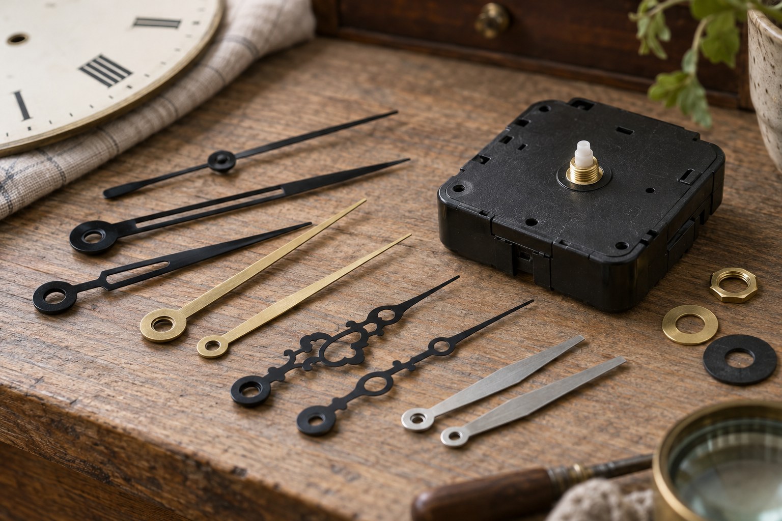
Make a paper mock-up with several time readings. Give the hour hand a recognisably different length and shape from the minute hand, using a compatible manufactured hand set for the eventual build. Colour alone should not be the only way to distinguish their jobs.
Check the finish as well
A glossy pale face can reflect a window, while metallic hands can change appearance as you move. Look at the proposed materials from the side and under evening lighting. A photograph is helpful for comparing layouts, but it cannot reproduce every reflection on the actual surface.
If the project concerns an existing modern craft clock, test the new scheme outside the clock before changing its face. Keep decorative layers flat and within the movement's specified assembly arrangement. For an old or fragile dial, make a separate reproduction design rather than repainting the original surface to suit the room.